Hobson’s Choice – Rising rates or a currency crisis

Just how much red pilling can a market take? How about the realisation that the economic recovery following the 2008 financial crash as been an illusion based on monetary easing that was conducted in a way to disguise the inflationary consequences, overstate economic growth while forcing investors up the risk curve, where they will be left stranded? Avoiding the temptation to launch a tirade against those who got us to this point, my concern today however, is trying to identify the trigger points for what may come next, that being either a currency crisis, or the imminent risk of one which forces discipline back into monetary policy.
When assessing our current position, one must first dispense with the illusion that the so-called post 2009 recovery is real. Asset prices have most certainly risen and risen significantly, but this is based on multiple expansion rather than real increased economic activity. How many are actually aware, for instance that the absolute increase in GDP growth across the US, EU and Japan since 2008 is less than the balance sheet expansions (or unfunded growth) of the central banks for those regions (see section under the “Marginal Buyer” on this site). This is of course is what happens when the market pricing of capital (and risk) is subsumed by cronyism, greed and fecklessness. The mechanism for this sleight of hand has been MMT and the artificial suppression of risk free returns and implied inflation which has impaired efficient capital allocation decisions, while also overstating ‘real’ growth. Has it been any surprise then that capital has flowed into earnings accretive schemes, such as share buy-backs and offshoring rather than internal investments and expansion? It is though nothing was learnt from Japan’s artificially low capital costs up to the late 1990’s and the punishing effect when these normalised.
And normalisation is basically what we are now facing and the inflationary chickens are coming home to roost. In this case in the form of stagflation. This is when the MMT music stops and rising input inflation meets the brick wall of falling real incomes and ability to pass on these costs, which squeezes ROIC, just as capital costs explode and crush the marginal returns on which companies had been basing their investment on. The music stops, when central banks no longer can keep artificially suppressing yields by printing because rising inflation is either breaching their legal mandates on this, or currency devaluations will do this for them, and considerably more brutally.
The relationship between monetary expansion and asset inflation is as old as time and even observed by Suetonius a couple of thousand years ago. For us, the lock-step relationship between central bank balance sheet asset expansion and the S&P500 makes the point.
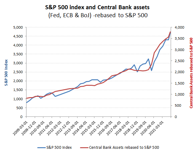
Yes, we’ve seen this before … US fed monetary easing raises equity valuations!
What is perhaps less well known however, is the mechanism behind this. As we refer to above and highlight in the section on this site titled the Marginal Buyer, this is not a function of either direct asset purchases of the S&P500 r even the positive impact on GDP, but from the impact and distortions to the multiple. By artificially depressing inflation expectations overstates real growth, while lowering the risk free return further reduces the OpFCF yield from which the asset value will be grossed up from . So restore a market derived and normalised risk free return, while dropping the growth discount and the derating against a falling trading return may prove to be as spectacular as to ride up.
The normalcy bias infecting markets has been the belief that one cannot buck the Fed and that low returns are the new normal. Or to put it anther way, that the Fed is ‘safe and effective’.
In the tab titled ‘Bonds‘ on this site I would recommend to you to review the longer term real interest rates on US 10 year Treasuries, that offer a proxy as a risk free return, but also the final chart which uses land rents going back deep into the middle ages to demonstrate that negative real yeilds are the exception, rather than the norm. For land rents, the real returns for most of the post medieval period have averaged an remarkably stable range around approx 4%, while the subsequent inflation linked government bonds from the 1980’s were averaging around 2-3%, until started artificially depressing yields by issuing new credit to buy them back in, notwithstanding continued structural government deficits. As can be seen from the below chart showing the 10 year TIPS yield against the US Fed total assets, firstly the direct impact of this Fed balance sheet expansion with the periods of negative yields and secondly, that this is only the second of these incidences, the first being in 2013 and which was not sustained for long.
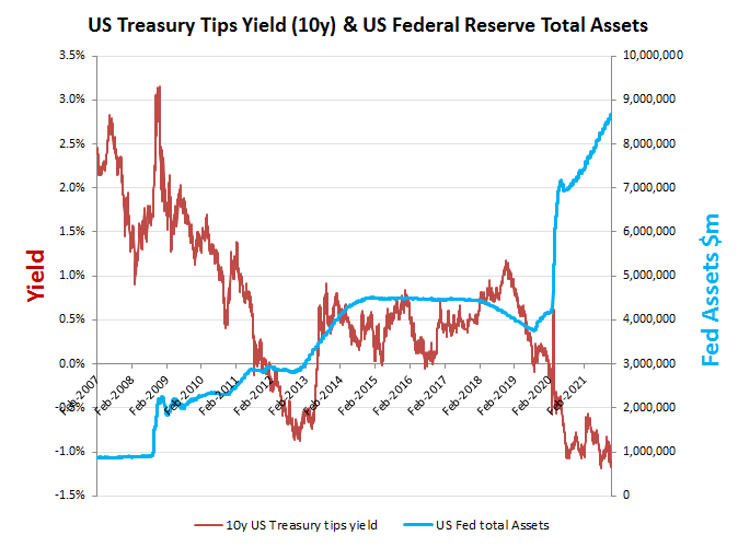
But this is why …it artificially depresses risk free returns
The big question now, is how long can the Fed keep on printing to artificially depress bond yields and thereby perpetuate the fiction that interest rates can remain low and equity valuations high on depressed earnings/OpFCF yields? What is clear from the below chart showing weekly Fed asset purchases, is that despite trying to craft a tightening narrative to stabilise confidence in the US dollar, this has yet to permeat thru to actual actions, with the asset purchases in the first three weeks of November totalling approx $119bn, which was indeed slightly higher than the $117bn comparative in October. Perhaps reflecting this, the Gold price is recovering and the US dollar is wobbling, so it will be interesting to see if this focuses a more serious response from the Fed into December. Note: The Fed traditionally makes its asset purchases in weeks 1-3 each month, with week 4 usually including a small reversal. Assuming a similar profile for November, that would suggest that the first evidence and data point of relevance will not therefore emerge until the end of the first week of December. Further evidence of inflationary pressures between now and then would presumably continue these trends, so a failure to act by then could exacerbate the process, perhaps to a point where the Fed is no longer able to control these events – dangerous times indeed!
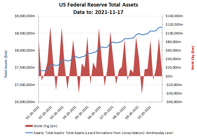
Which is why this chart is the key!